
Today’s designs are created digitally on a computer or tablet. However, there are a lot of elements that must be considered before a design is ready to be printed on paper. Things like bleeds, image resolution, and color profiles are critical to creating the end product you hold in your hand.
If you’re preparing a design project for print, make sure you’re setting your files up correctly by using these four tips.
1. Understand your desired outcome
Before you begin any print project’s design, it’s important to know what outcome you or your client is expecting. What type of product are you producing with this design, and what are its parameters? Different project types may influence the way your design is laid out, where you place images and text and much more.
For example, if you’re designing a tri-fold brochure, you’ll need to make sure your panels are the correct sizes to accommodate the folds. Uneven panels will make for a sloppy-looking print job!
Or, understand how many pages you’ll need for a saddle-stitched booklet. These booklets must be divisible by four because of the way each sheet of paper is trimmed and folded. If you don’t have enough pages in your design, you may need to add blank pages or remove pages to reach a multiple of four.
The most important rule is to understand the requirements and limitations of the production process you are using. Be sure to follow those guidelines in your design so they translate well onto the printed page.
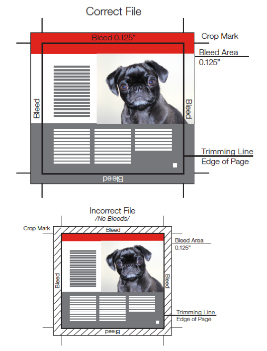
2. Set up bleeds
Most designs incorporate color that’s intended to run right to the edge of the page. In order to create this effect, you’ll need to use bleeds.
A bleed is a section of color or image that extends beyond the edge of the finished piece. Because printers cannot print right to the edge of the paper, the design must include a bleed area that’s trimmed down after printing.
A typical print bleed is a .125-inch space around the edge of the design. The colors or images from your design will “bleed” into this area. Then, when the printed page is trimmed down to the correct size, the color will go all the way to the edge of the paper.
Without bleeds, designers run the risk of leaving a white border around the edge of the paper after it’s trimmed. This can be unsightly, especially if the borders are uneven! Bleeds ensure that the edges of your project look just as you intended.
To prepare your design file for print, make sure you set up a bleed area with bleed information like crop marks and trim lines. This information will not be part of the finished piece. Instead, they will show that your color extends properly and instruct the printers on where your paper should be trimmed.
3. Check image resolution
Images change a lot between digital and printed design. A photo might look great on screen but appear blurry on paper. This is why it’s important to pay attention to the resolution of the raster images you include in your design.
Online images typically use low resolutions—around 72 pixels per inch (ppi). However, printed images need a higher resolution—around 300 ppi. Because printed materials are larger, the images need more pixels (dots of information) to appear crisp.
Any time you choose a raster image for your design, check the resolution to make sure it’s the correct size for print. Higher resolution images will produce clearer, more precise print products. You can always crop or size down images to fit your design, but you can’t size them up and retain the quality!
4. Pay attention to color profiles
Computer screens and printers use different systems to produce the colors that add life to your design. For this reason, what you see on the screen might not be what you see on paper. Typically, computer screens uses RGB (red, green, blue) color. Print is often produced using CYMK (cyan, yellow, magenta, and black).
RGB produces color by blending red, green and blue on a digital screen with light. This often produces a very broad scheme of bright, vibrant colors. However, CMYK uses ink dots and is much more limited in scope. The more ink that’s printed, the duller and darker the colors become. This is why there can be a large discrepancy between RGB and CYMK colors.
Unfortunately, it’s not always possible to make colors exactly the same from digital to print. There are simply too many variables in place. However, you can reproduce color more accurately by paying attention to the color profiles you use during design. Convert your digital file to CMYK before printing to check the colors and modify for the best results.
If you’re trying to match to a very specific color, you might also want to consider PMS (Pantone Matching System, or pure spot color). Unlike CMYK, which layers ink dots during printing, PMS color is mixed before it’s applied to a surface to ensure a true match. PMS allows for a greater color spectrum and will return more consistent result across digital printing.
Turn to the experts for Pittsburgh printing
In order to receive the best results for your print project, work with a firm like AlphaGraphics Pittsburgh. Our Pittsburgh printing experts can help turn your design into a showstopping printed piece.
We’ll be there to guide you from start to finish. Our experts consult with clients to help them decide on the best way to produce their print job. We’ll provide paper samples and past print job examples, then explain printing methods, so you have all the information you need. Once your design is complete, we offer hard proofs so you can see your print job in person and make any necessary changes before the final products are done.
Ready to jumpstart your next print project? Contact AlphaGraphics Pittsburgh to get started!