
The past few years in design have been dominated by bold colors and complex imagery. Design in the new decade is a bit more reserved and streamlined. Keeping up with the latest trends in the design world is important when trying to keep pace in an ever-evolving marketplace. But staying on top of it all can be daunting. To help you out, here are 5 essential trends for 2020 that will keep your marketing collateral ahead of the curve.
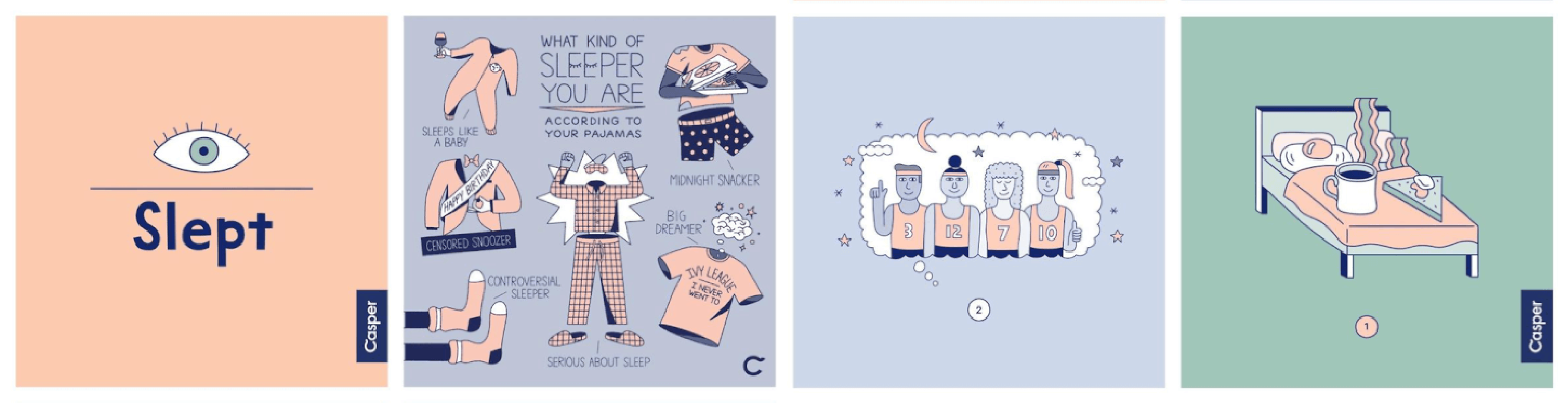
Casper Social Media Graphics
Muted Color Palettes
It may seem counterintuitive, but brands are moving away from bold and vivid color trends of the past few years in favor of more muted color palettes. If you’re thinking these unsaturated colors mean things will be less colorful, think again. Muted colors go beyond Easter pastels and run the gamut of the color spectrum. Color might be more reserved, but it definitely won’t be boring.
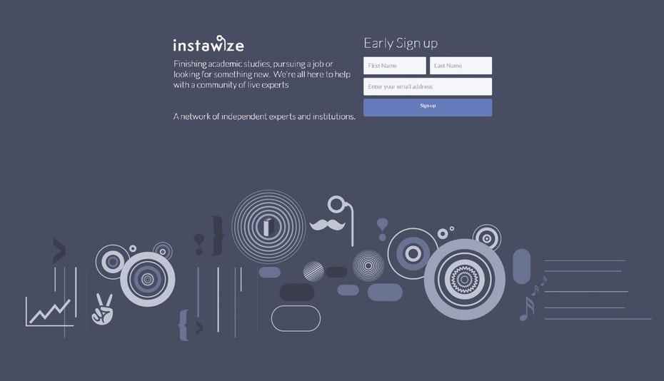
Instawze.com webpage design by Andy
Monochromatic Design
Playing with the subtlety of muted colors is monochrome design. Think of black and white images with color overlays. These images may seem simplified, but they present color themes in bold compositions that speak directly to your brand.
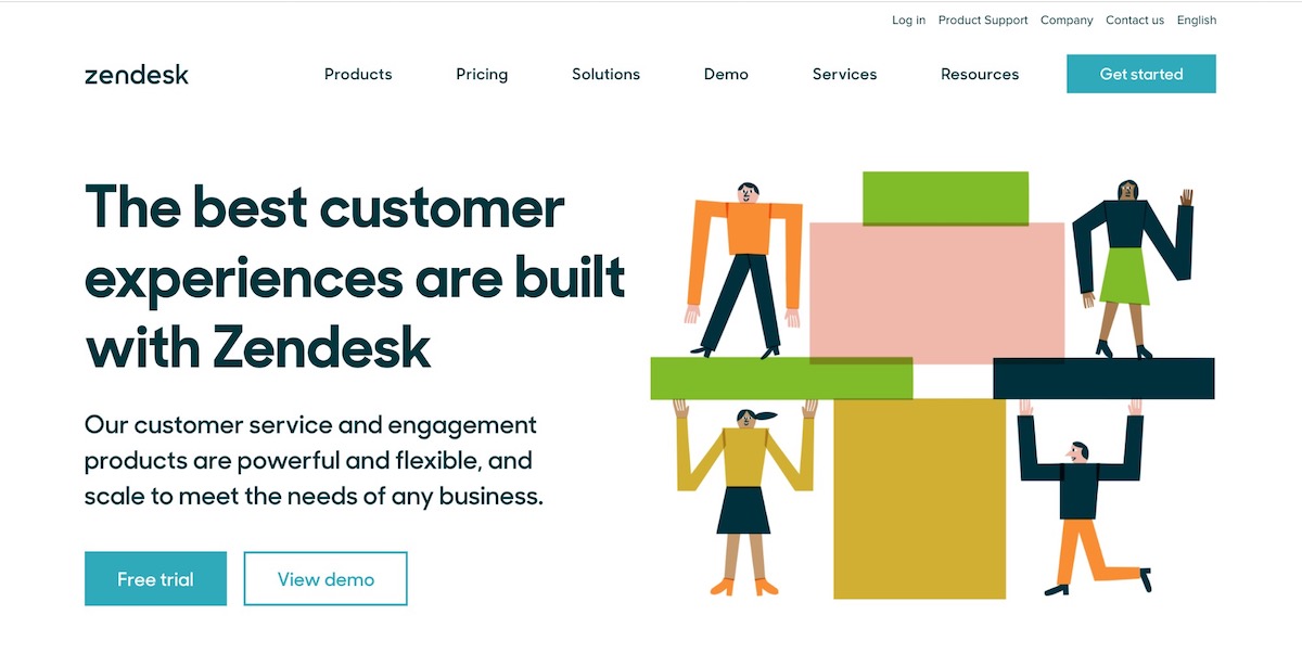
Zendesk.com webpage
Minimalist Landing Pages
Muted colors and monochromatic design aren’t the only shift towards more subtle, direct design. Minimalism is king of landing pages. Minimalism in landing pages not only communicates more directly with your customers by cutting straight to the point, but it allows your customers easier access to your brand. Landing pages that are designed minimally load more quickly and efficiently on mobile devices, which benefits your rank in search engines. Minimalist landing pages are a perfect pairing of form and function for your brand.

Neue Haas Grotesk by Christian Schwartz
Heavy Bold Fonts
It’s going to get a lot bolder! While colors are going to become more muted, images more simplified, and landing pages more minimalist, type is going to get BIG. The extreme contrast of heavy type on muted backgrounds is going to make your message really stand out while making your graphics look modern and trendy.
PRO TIP: Don’t go crazy. An entire page of text in heavy type will be hard to read for anyone. Use bold fonts strategically to reinforce your messaging.
Booklet with Clear Ink by AlphaGraphics in the Cultural District
Design that Shines
When it comes to print, nothing stands out quite like something shiny. Bold metals pop off page to help your brand and designs stand out. But metals aren’t the only way to achieve that glimmer. Clear ink adds a subtle shine that conveys a sense of luxury and class. Whether you’re looking to see your brand in an elegant metal, or add a playful visual effect with clear ink, shine is the name of the game.
PRO TIP: Interested in seeing clear ink in person? Contact one of our specialists to get a sample of clear ink sent directly to you.
Need more guidance in keeping your marketing and design on-trend? Contact us today to learn how our experts at AlphaGraphics in the Cultural District can help with your design, print, signage, and digital marketing.