Successful businesses know that it’s not enough to create a great product. You have to design and market it well to really get attention. Graphic design plays a major role in how your products are perceived by customers and can even impact how well they sell.
In fact, 72% of Americans say that the design of a product’s packaging influences their decision to buy. This is because packaging does so much more than simply identifying and protecting your product. Great packaging attracts customers’ attention, solidifies your branding and helps you stand out in the marketplace. If you aren’t leveraging the power of package design, you could be missing out on better sales and stronger brand identity.
As part of your brand development efforts, consider these three main goals for product packaging.
Attract Customer Attention
The number-one goal of your packaging should be to get consumers’ attention. Creative packaging design makes a strong first impression and makes people want to learn more about the product. Because people are visual learners, they can perceive a lot from a strategic mix of illustration, color, typography and texture.
Consider what you want your packaging to convey to customers. Should it be bold or simple? Luxury or convenient? Use color theory, material choices and imagery to support the product’s messaging. Add text to clearly state the product’s name, tagline and any other necessary information.
No matter what your packaging “says” to the customer, you also want it to be eye-catching and memorable. Make it visually interesting, but avoid using too many elements that clutter the design. The end result should be clear and visually attractive to the buyer.
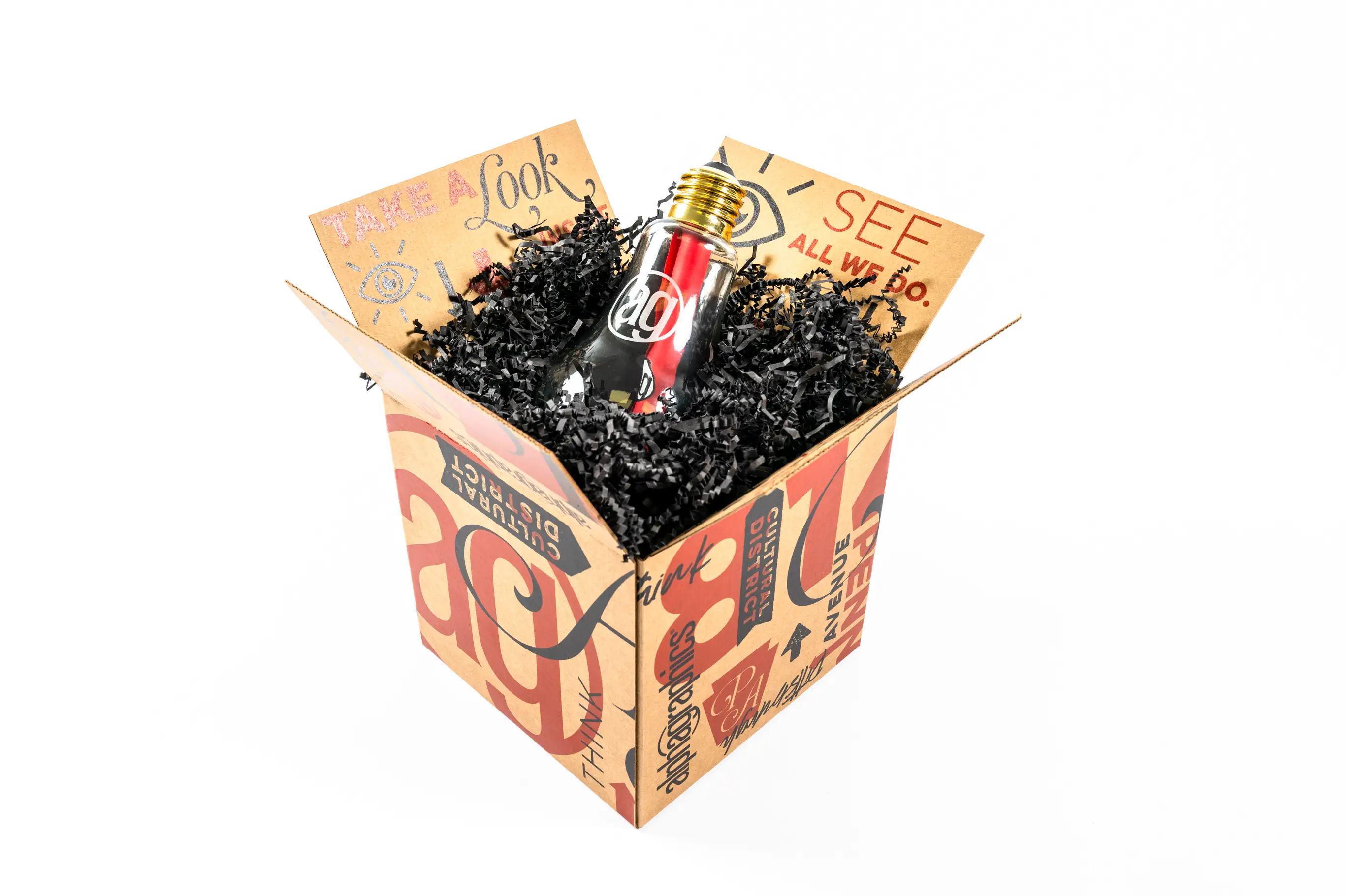
Attractive packaging can go further than just catching the eye of a customer in a store, as well. Packaging used for mailing, such as boxes, tubes and other dimensional direct mail, is equally as important. Use your direct mail packaging as a way to create an experience for your customers when they open it at home, whether they’re receiving a product they purchased or an invite to an event. Plus, in the digital age, buyers are more likely to post photos of unique packaging on social media or share unboxing videos. This can help attract even more customers to your brand!

Support Your Brand Identity
In addition to reflecting the product itself and the marketing messages you’ve created for it, packaging should also reflect your branding. This doesn’t mean you should simply slap your logo onto a cardboard box. Instead, find ways to incorporate your larger brand identity into every package design.
The goal is to create a seamless brand story across every touchpoint a customer has with your brand. From your logo, to your website, to your social media ads, to your packaging, every element should be cohesive and recognizable. This helps improve brand recognition and minimizes confusion between you and your competitors.
Use similar color palettes, typography and image styles in your packaging as you do in your logo. Material choices are also important. The packaging styles you choose should reflect your brand’s tone, voice and values.
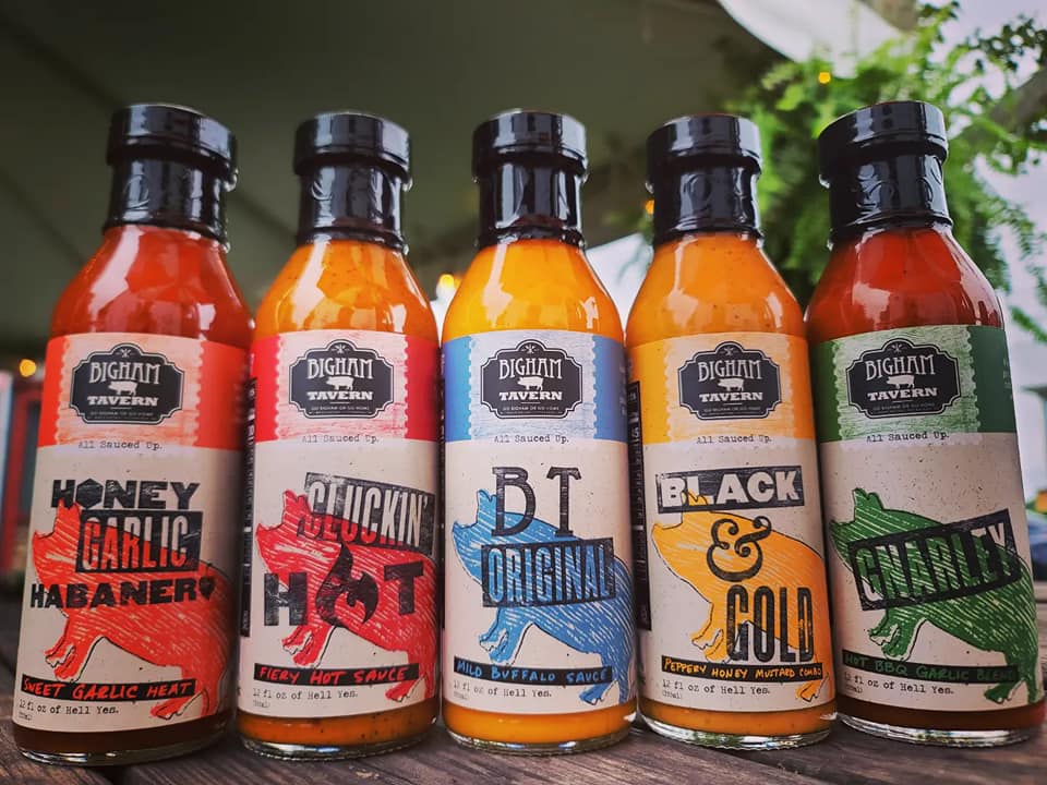
Consider an example. One of AlphaGraphics Pittsburgh’s clients, Bigham Tavern, is well-known for its wings and has been voted “Best Wing Night in Pittsburgh” for nearly 10 years in a row. To take their wings’ success to the next level, Bigham Tavern bottled their famous sauces to sell at their restaurant and in city markets and grocery stores. The AlphaGraphics Pittsburgh team created eye-catching wing sauce labels for five of their top flavors, differentiating them with colors in a classic palette. The package design remained true to Bigham Tavern’s branding, using cohesive elements that tied back to the restaurant menu, such as distressed, handwritten and stamped typography, wood grain textures, dripping sauce graphics and their iconic pig logo. Customers exploring the sauces can immediately recognize the Bigham Tavern branding and
understand what the product is.

Differentiate from Competitors
Lastly, the graphic design on your packaging should help your product stand out from your competitors. You don’t want your product to be mistaken for another company’s, or vice versa. Use creative design to differentiate yourself within the market.
Achieving differentiation requires a strong understanding of your competitor’s products as well as what makes yours different. You might use text and imagery to highlight your product’s value propositions. Or, you might leverage a different color palette or packaging material to make your product look entirely different from others on the market.
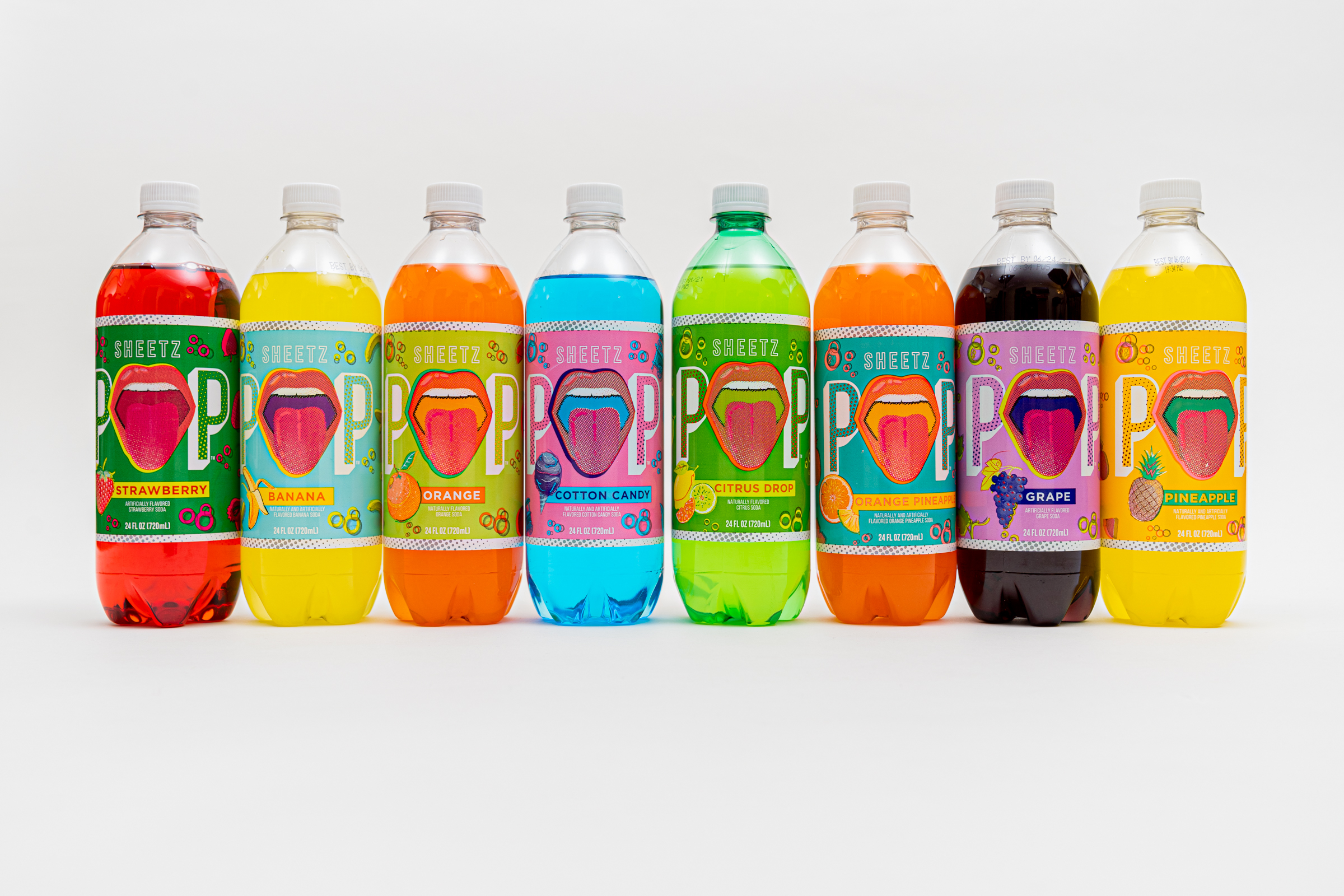
AlphaGraphics Pittsburgh accomplished this kind of differentiation with Sheetz Pop labels. Sheetz launched a new product in the soda world, including 14 flavors to be sold in their convenience stores. Because there are so many competitors in the soda market, Sheetz Pop needed to use creative packaging design to stand out. The AlphaGraphics Pittsburgh team used vibrant, eye-catching illustrations, overlapping graphic elements and colors to create bold designs reminiscent of Andy Warhol and the pop art era. Color was used strategically for the 14 flavors, with consideration made to the color of the soda within clear bottles and how the colors would look together in the store. In the end, the labels stand out from competitors and also reflect the Sheetz brand—fun, bold, memorable and breaking free from the ordinary.

AlphaGraphics Pittsburgh Creates Packaging that Pops
There are a lot of elements to consider when putting together package designs that attract buyers, reflect your brand and stand out in the crowd. By getting innovative with your product packaging, you can increase sales and help customers remember your brand.
If it’s time to refresh your current packaging or create a design for a brand-new product, contact AlphaGraphics Pittsburgh. Our graphic design experts can help you create great packaging that pops!
